White / cobalt / amber
Inner face: cobalt.
Outer face: amber.
A neutral base keeps the functional contrast legible on both shoes.
PERFORMANCE / DESIGN DEVELOPMENT
Footwear, apparel, and training tools that belong to one movement language. Original design. Intentional materials. A mark that means something.
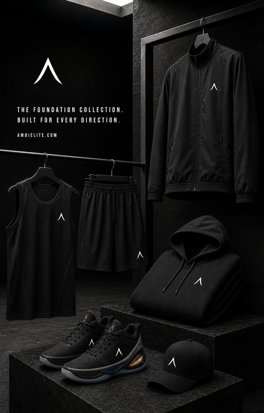
01 / THE FOUNDATION COLLECTION
The original identity stays simple. Training layers, full-length outerwear, shorts, and footwear belong to a single collection—not a collection of unrelated logos.
Explore the visual direction, then the details behind it: material, fit, placement, and the inner/outer distinction on each shoe.
Development concepts—not a live store or manufactured range.

FROM THE SELECTED CAMPAIGN DIRECTION
A gold-dominant silhouette, a dark green outlined mark on the outer face, and a quiet inner face. The material stays visible inside the outline.
This campaign direction is the reference point—not a reason to repeat the same logo on every panel. Future product views should preserve its proportions and intentional placement.
Concept direction from the existing campaign collection. Not a manufactured product or a purchase offer.
THE FOOTWEAR BRIEF
The inner and outer faces of each shoe carry different cues. The distinction runs along the sides—not from toe to heel, and never one color per foot.
Inner face: cobalt.
Outer face: amber.
A neutral base keeps the functional contrast legible on both shoes.
A gold-dominant upper with dark emerald stitching and structure. The lateral mark can be outlined, allowing the gold material to remain visible inside it.
Colorway directions—not manufactured specifications. Alternative product palettes do not change the blue/inner and orange/outer teaching key used in educational diagrams.
DESIGN STANDARDS
Substantial support and sculpted geometry meet contemporary movement. The brand lives in materials, proportion, and finish—not in an oversized logo on every surface.
A hero mark on the quarter can be balanced by a quiet tongue. Heel placement offers another design direction.
Stitching, texture, panel structure, and edge finish create identity at close range.
Every view must describe the same silhouette, panel layout, and inner/outer system.
Proper garment length, coherent fit, clean seams, and marks placed only on fabric or product surfaces.
LET’S BUILD WHAT COMES NEXT
We welcome conversations with footwear designers, apparel developers, material specialists, and manufacturing partners. The first collection is in development.
Start a conversation